Naming
The acronym GWMC stands for “Gross, Welch, Marks, Clare.” This is the acronym we felt made the most sense after the two firms merged. We chose this name as it is a strong, straightforward statement that reflects what we do best: address our clients’ issues and get them the care they deserve. It also speaks to the firm’s culture of always putting their clients’ needs first. This name sums up their mission perfectly and reflects how they go about everything they do, by focusing on understanding their clients’ unique needs, building trusting relationships, and helping them achieve the life goals that matter most.
Logo Design
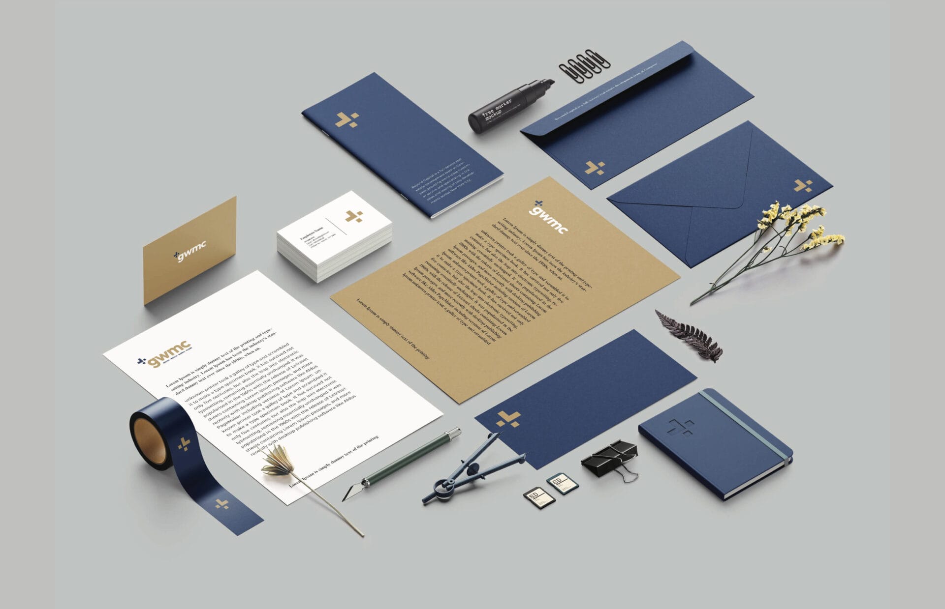
The logo combines the plus symbol and the greater than sign, and it is a reflection of the company’s guiding principle, “greater than the sum of our parts.” It’s also meant to reflect the value the company provides. We chose the colors blue and gold because they are so associated with elegance and speak to the company’s premium nature. The color scheme is also bright, bold, and cheerful. We feel this rebrand helps GWMC remain current, and attract a younger audience. We wanted to create a simple, bold and universal logo that would stand the test of time.
Print Design
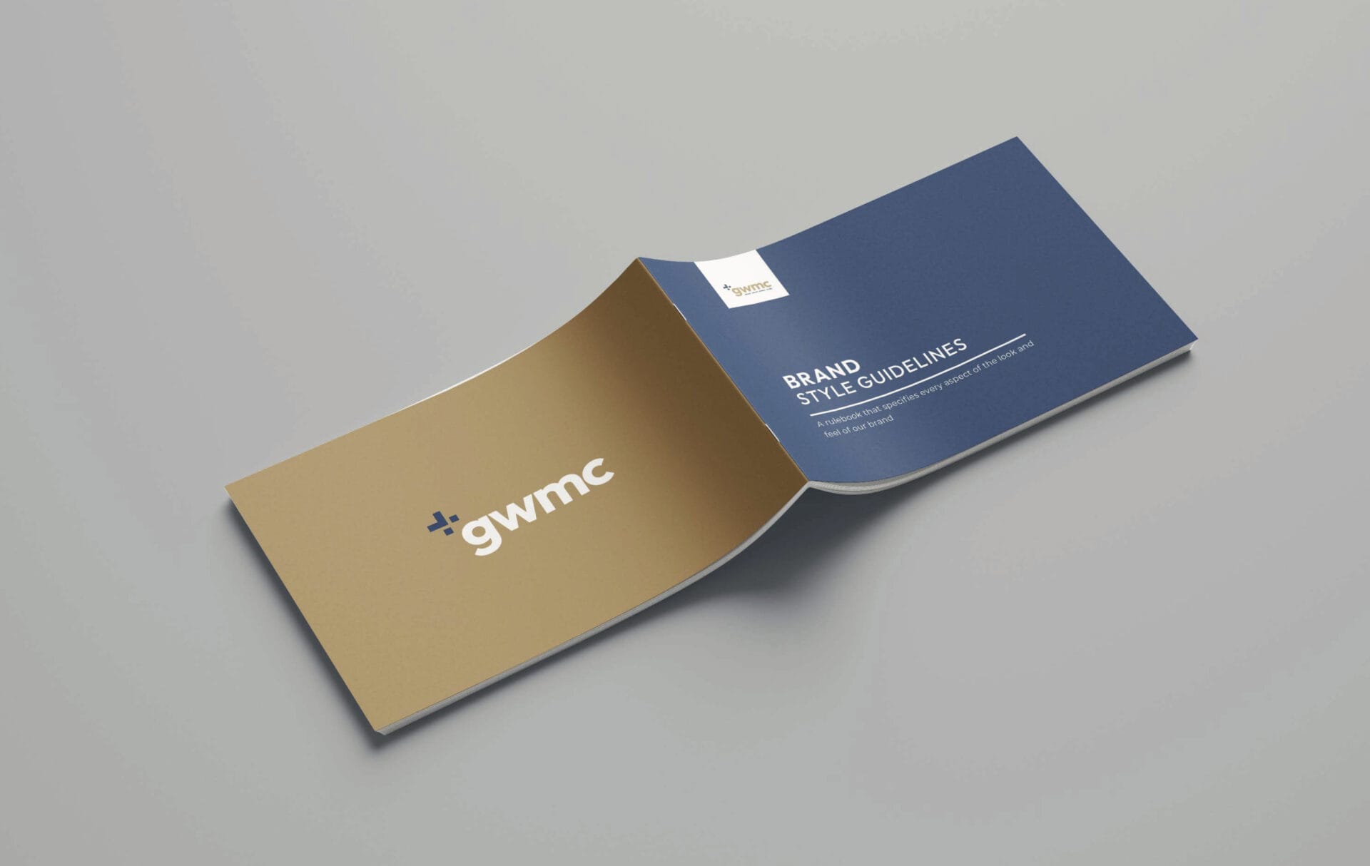
We created a modern print materials system that had a clean, modern and inviting look and feel to it. It was built on the idea that the complete collection of all the materials is one whole system. The color palette was based on the brand colors and the content was designed to be clean and easy to read. Our design concept features a clean and functional layout, where the shapes of each element on the page are clearly defined. The color palette is composed of a harmonious blend of blue and gold, which brings out the natural beauty of the brand assets.
Website Design
Websites are important, it’s where everyone goes to find out about your services. You need a site that is not only functional and easy-to-navigate, but one that also reflects your brand’s values. When we started the GWMC project, the goal was to create a modern website with a focus on content and functionality. The previous website was a WordPress site that had been through several iterations, and it was time for an overhaul. The new site is built on a custom platform, which allows us to easily manage the content and create new features as the business grows. We designed the site with mobile and tablet devices in mind. Click a few buttons and the website scales to fit your device.

Photography
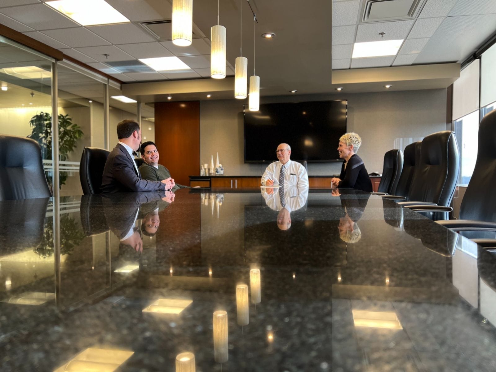
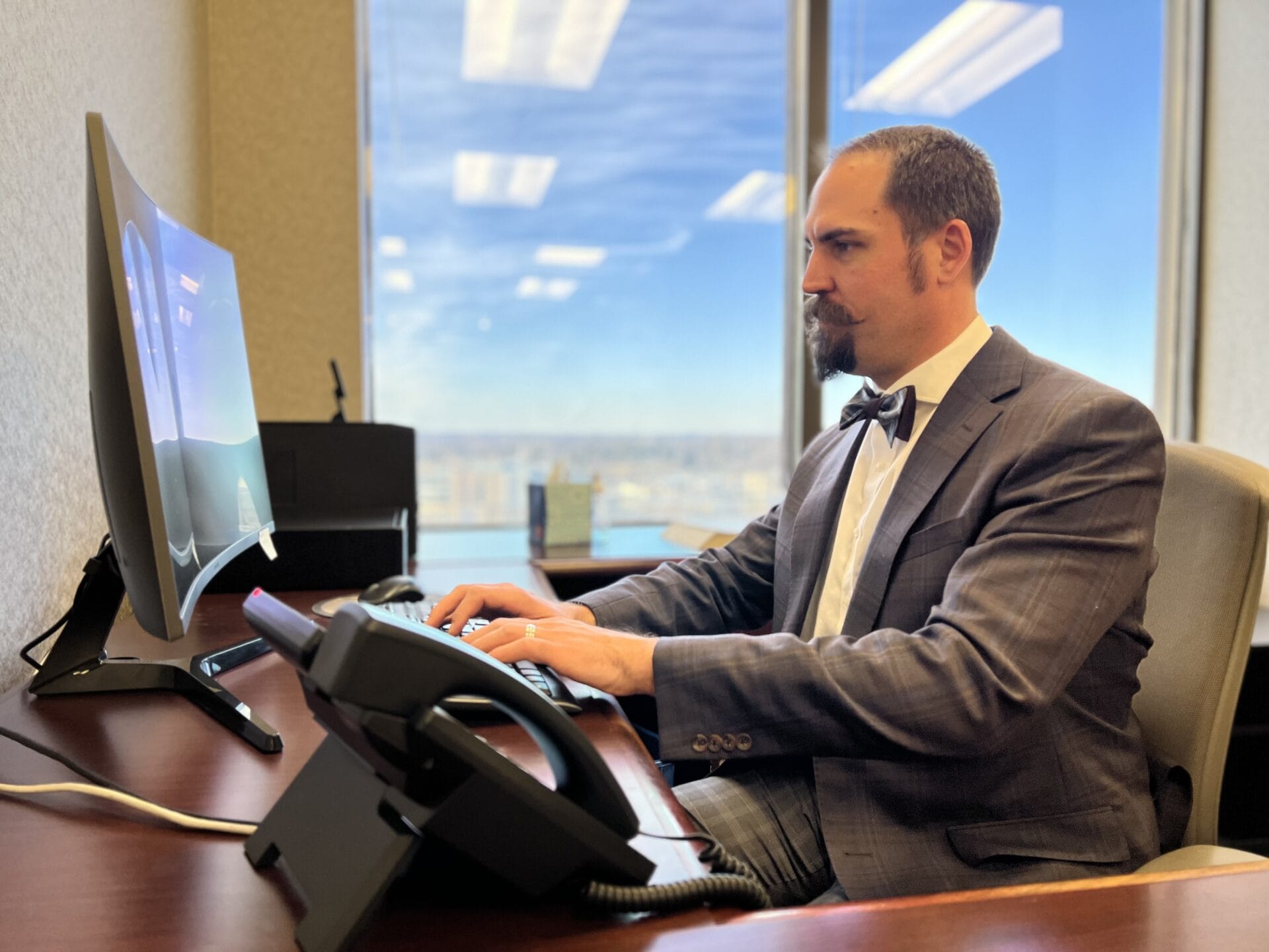
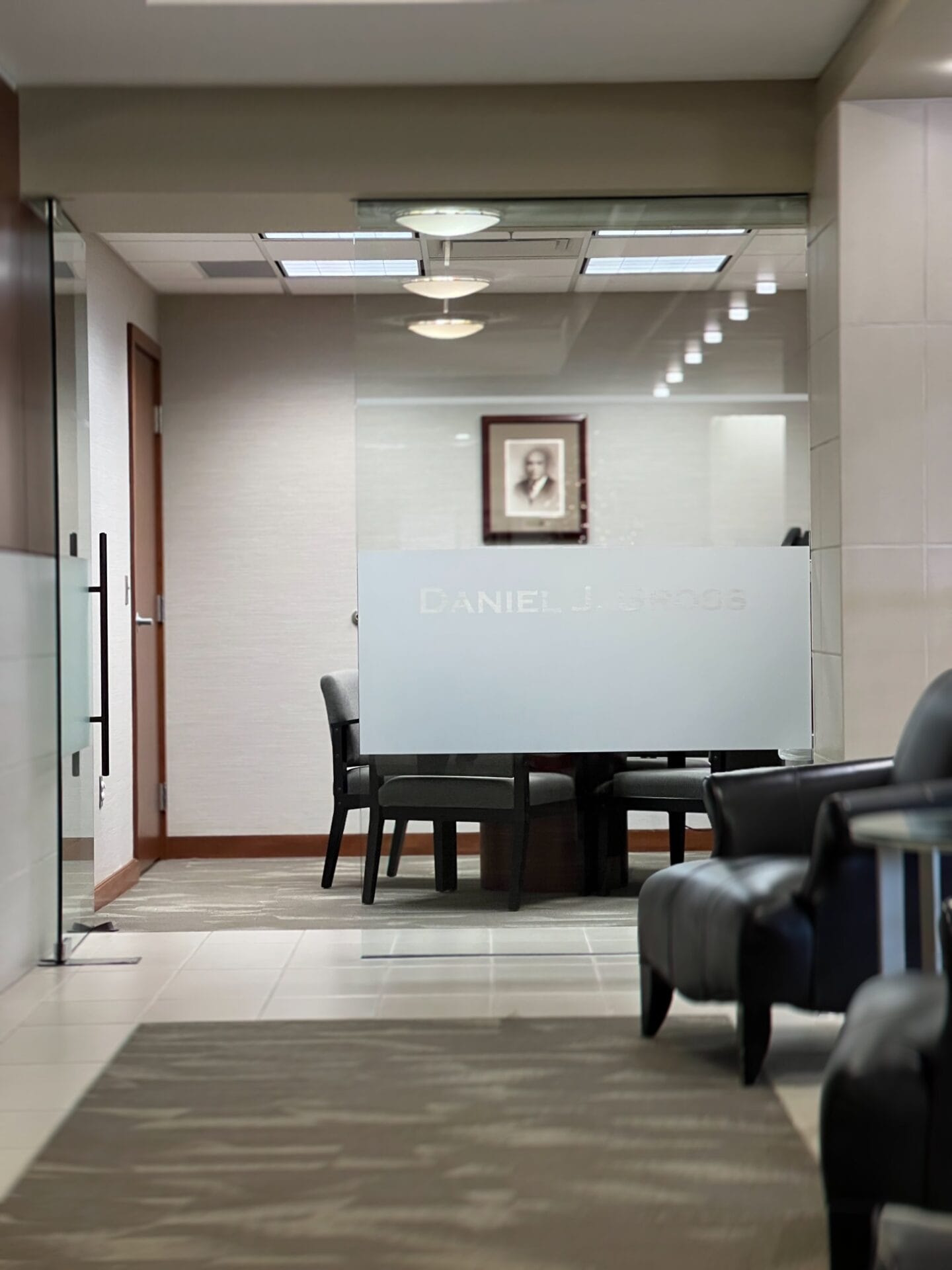
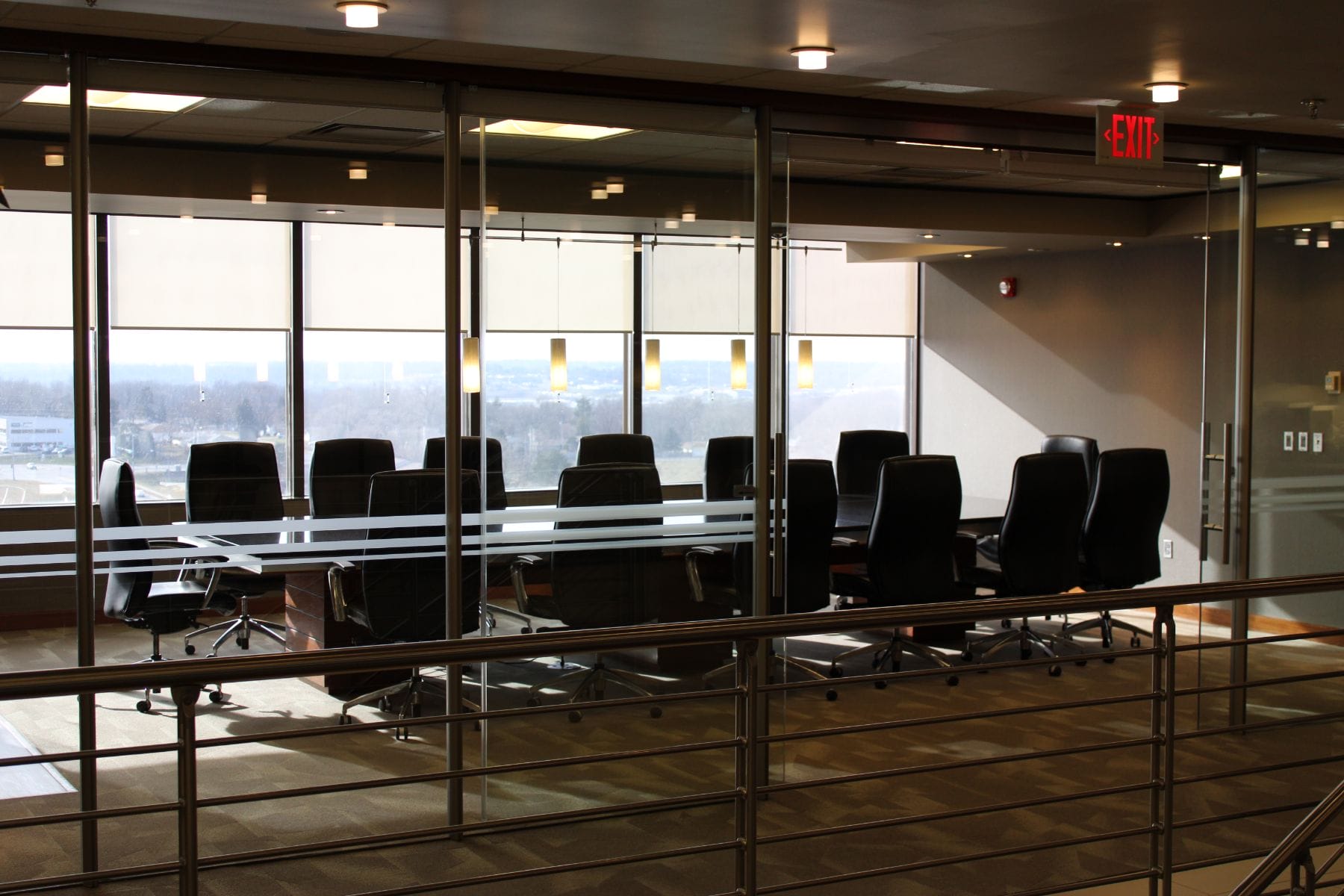
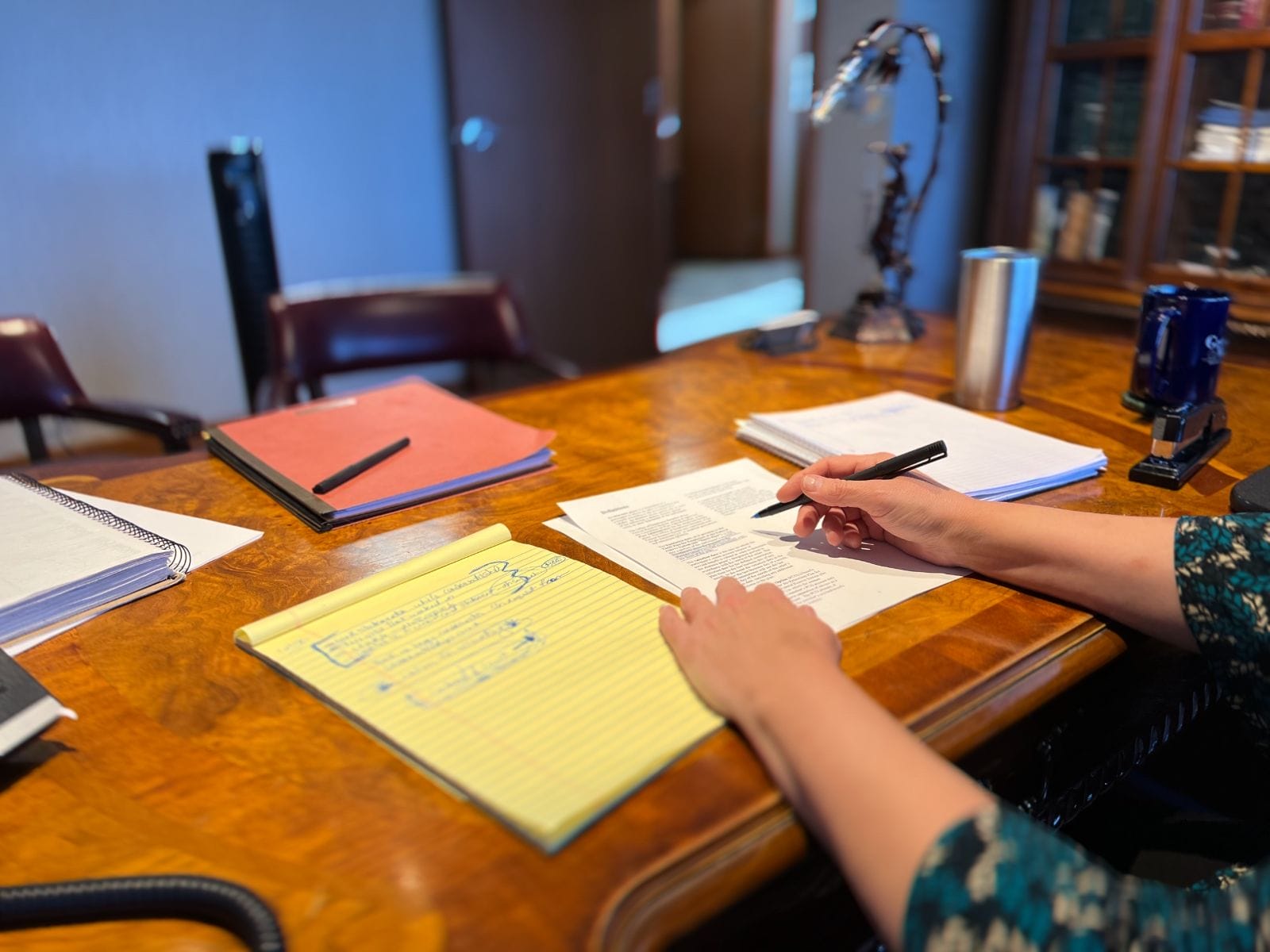
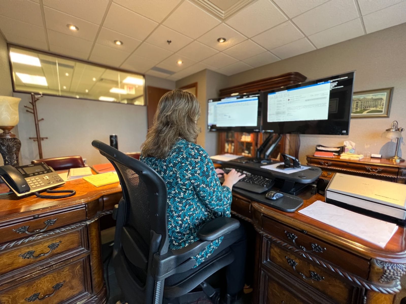
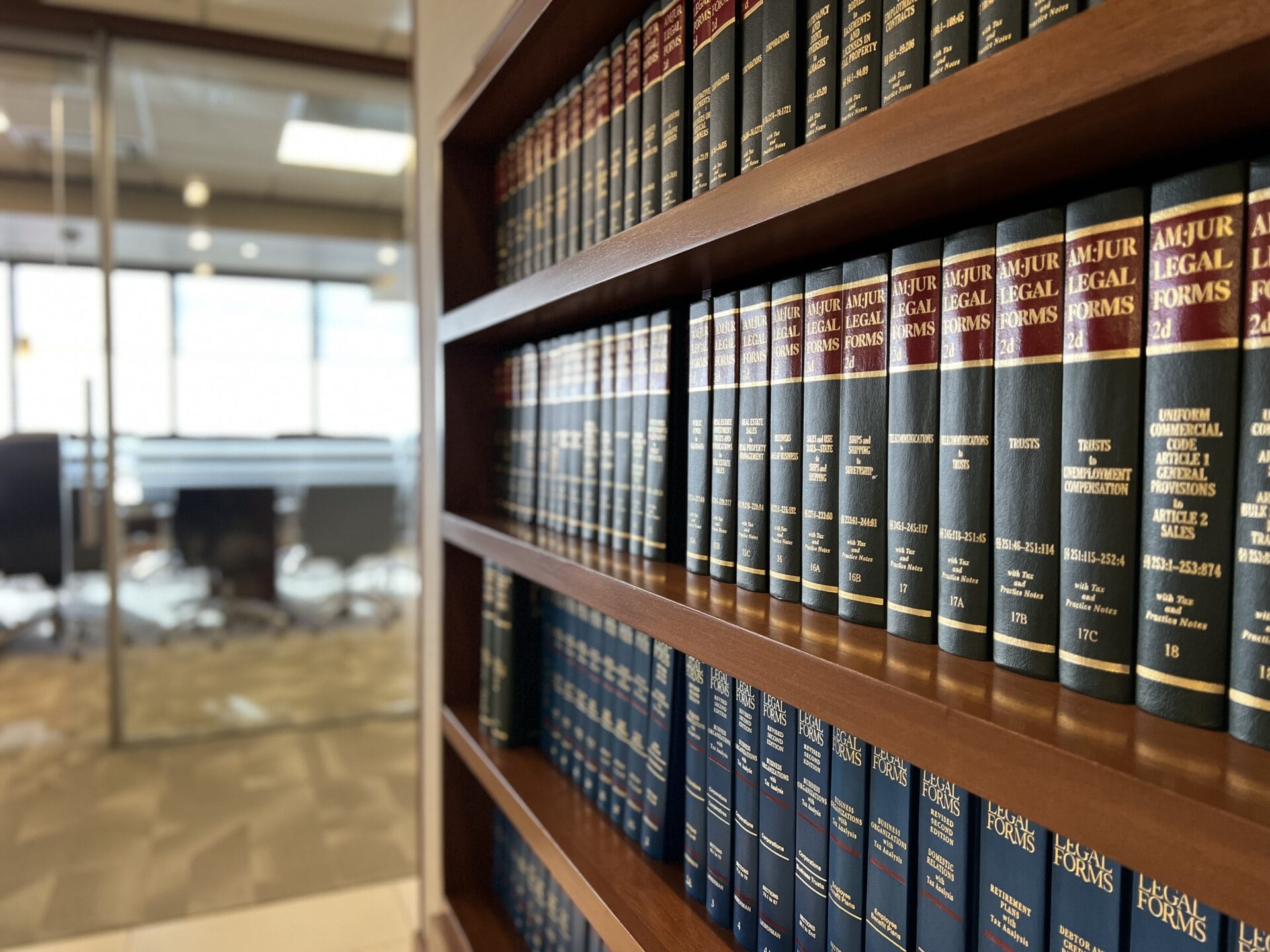
One of the best ways to establish an authoritative online presence is through strong images and visual content. This law firm did just that by taking photographs of their facility, staff, services, and more. Images are also a powerful way to represent your brand and establish trust. If a potential client views your law firm website or social media page, they’ll see photos of your employees in professional attire as well as images of the work they do. This GWMC has done an excellent job at creating a clear brand for themselves. They’ve established trust with their audience using visuals and photos that show audiences exactly what the company does, who works there, and what kind of services they offer.
