
Naming
Platte River Concrete Co. (formerly Consolidated Concrete) was established in 1966 and has been serving Omaha and surrounding areas for over 50 years. With 4 concrete plants and over 70 trucks in their fleet they are one of the largest concrete providers in the midwest. As they grew and the reigns were passed down to a new generation they wanted something that would differentiate themselves for the next 50 years.
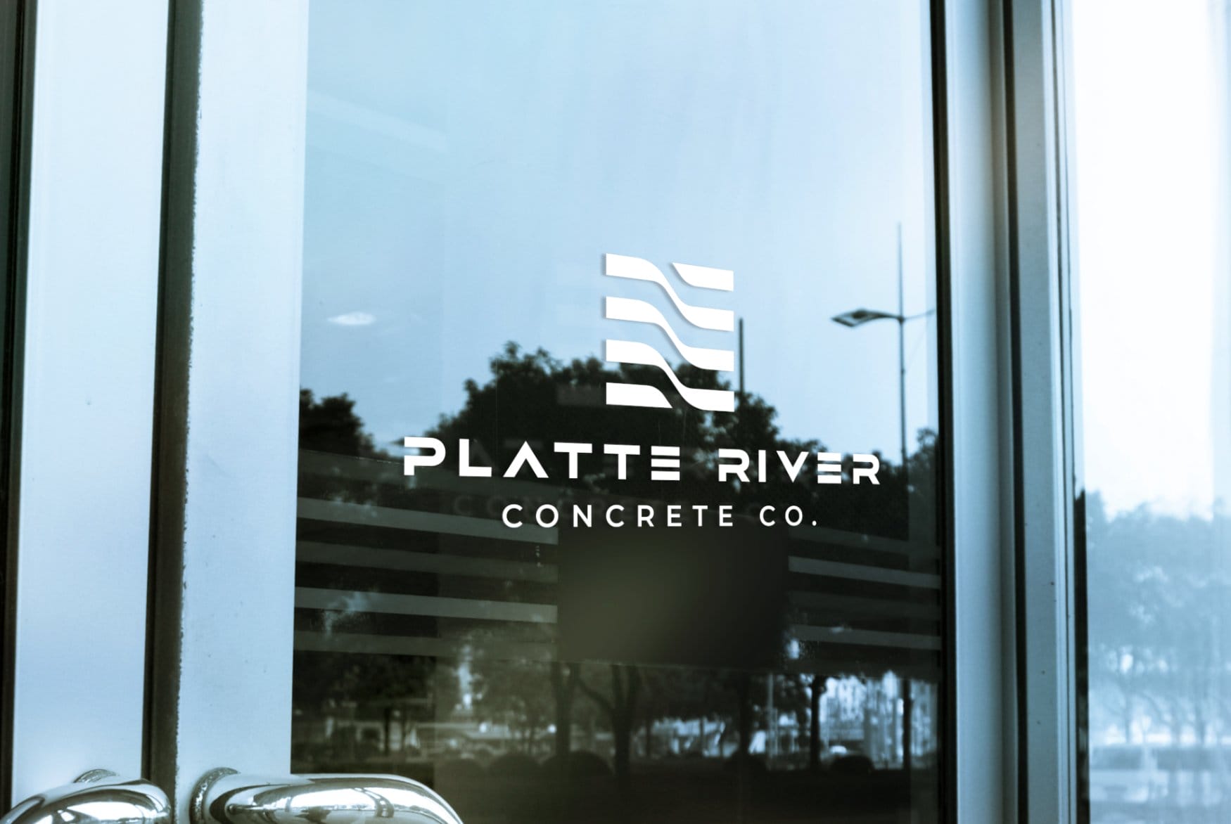
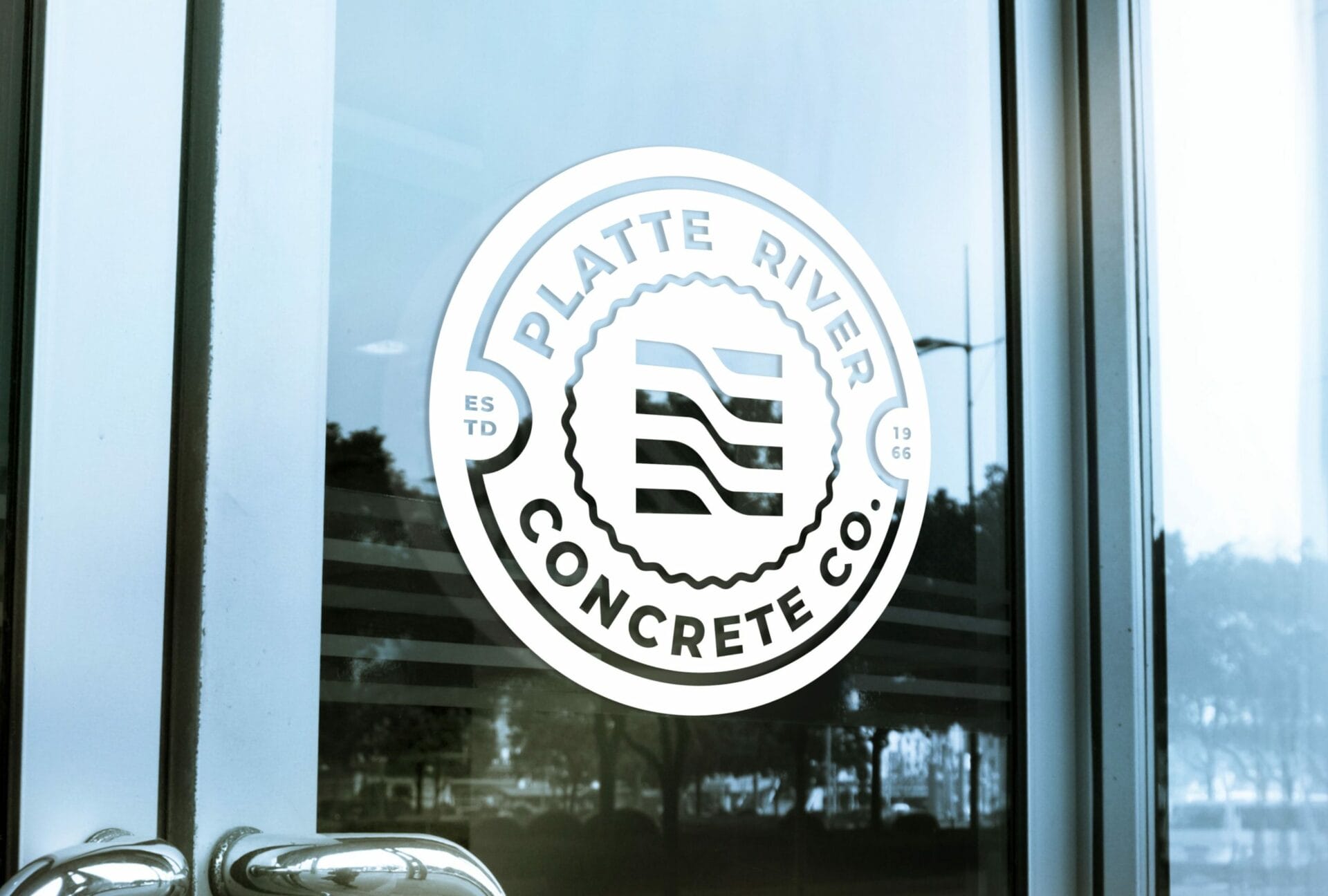
Logo Design
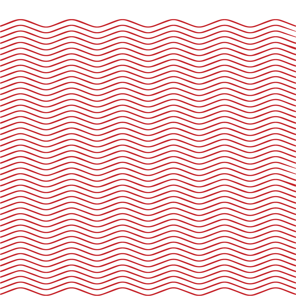
We created a logo that symbolizes the flowing water of the Platte River. Itʼs clean lines and delicate curves, along with its red and white tones, emphasize the clients Nebraska roots. In order to create our new identity for Platte River Concrete we went through around 20 variations of this flower water before finding the perfect ideation. To make sure that the logo worked together with itʼs sister brand (Harmʼs Concrete) seamlessly we created a unique typographic treatment for both logos to work together without being too similar or clashing visually.


Secondary Assets
With Platte River Concrete, we created a brand identity that was more than just a logo. We created custom illustrations and art pieces that helped expand their brand. In order to develop our new identity for them, we started by conducting research on their current identity. We wanted to figure out what made the company feel like it had a unified voice and then focused on those specific ideas as themes that carried through into every piece of their marketing collateral. These illustrations helped paint an even bigger picture of the company’s personality in an effort to achieve maximum acceptance from the public while still maintaining their core style and aesthetic value.

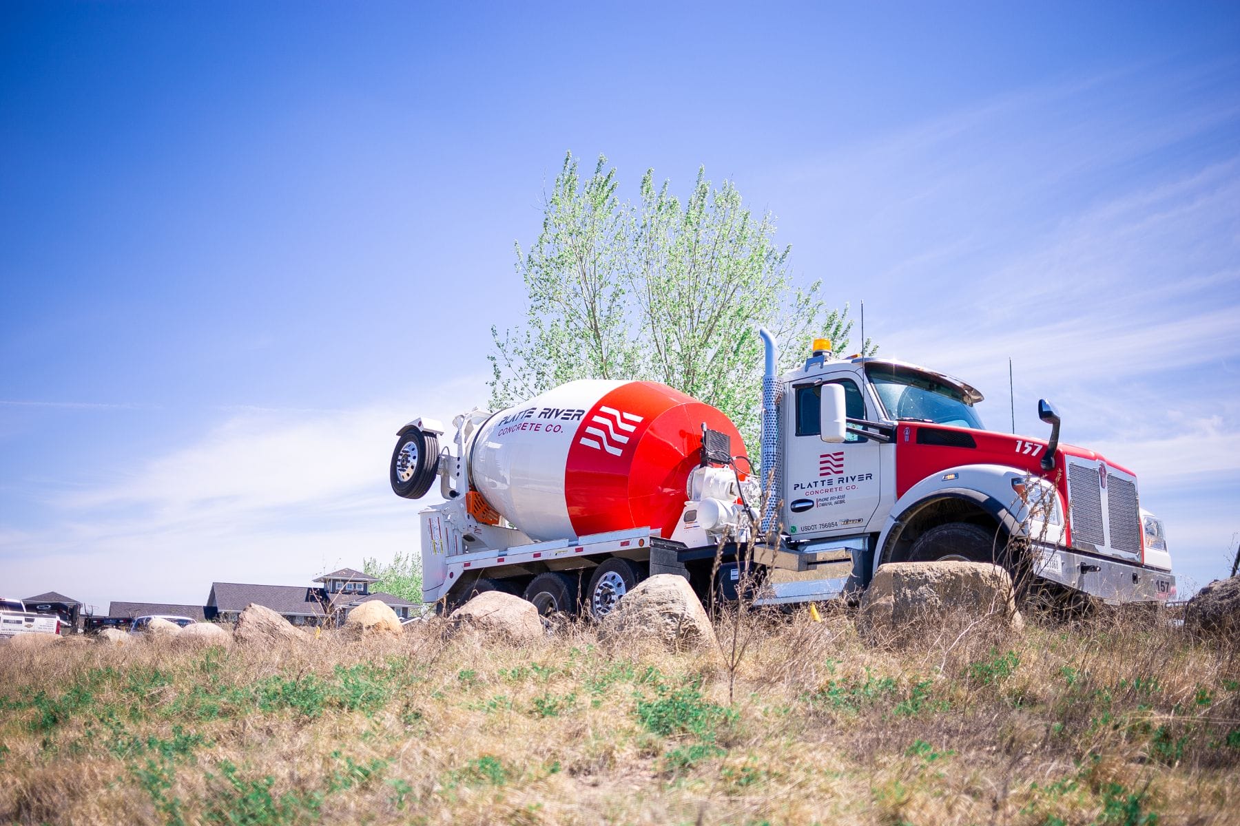
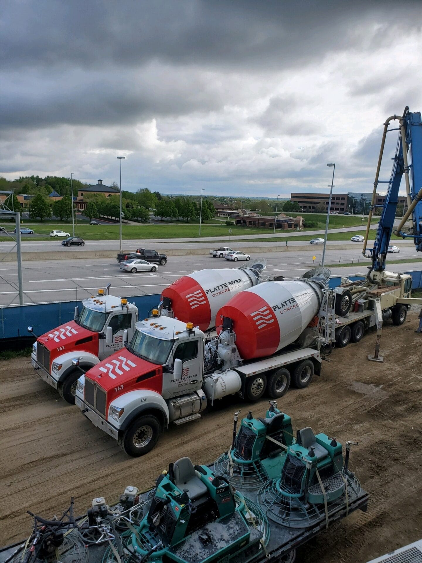
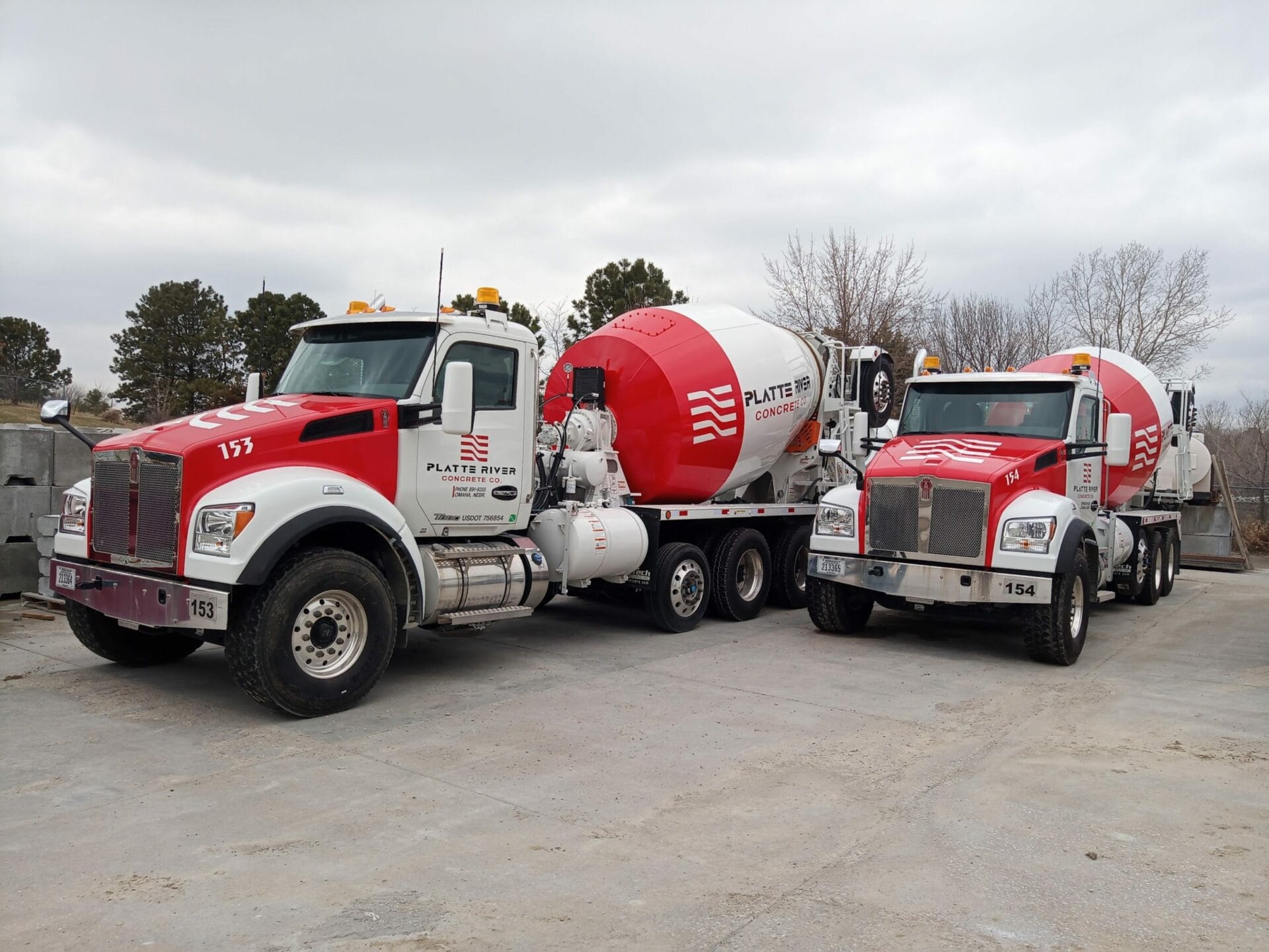
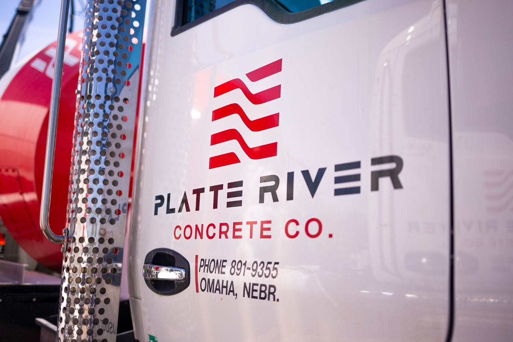
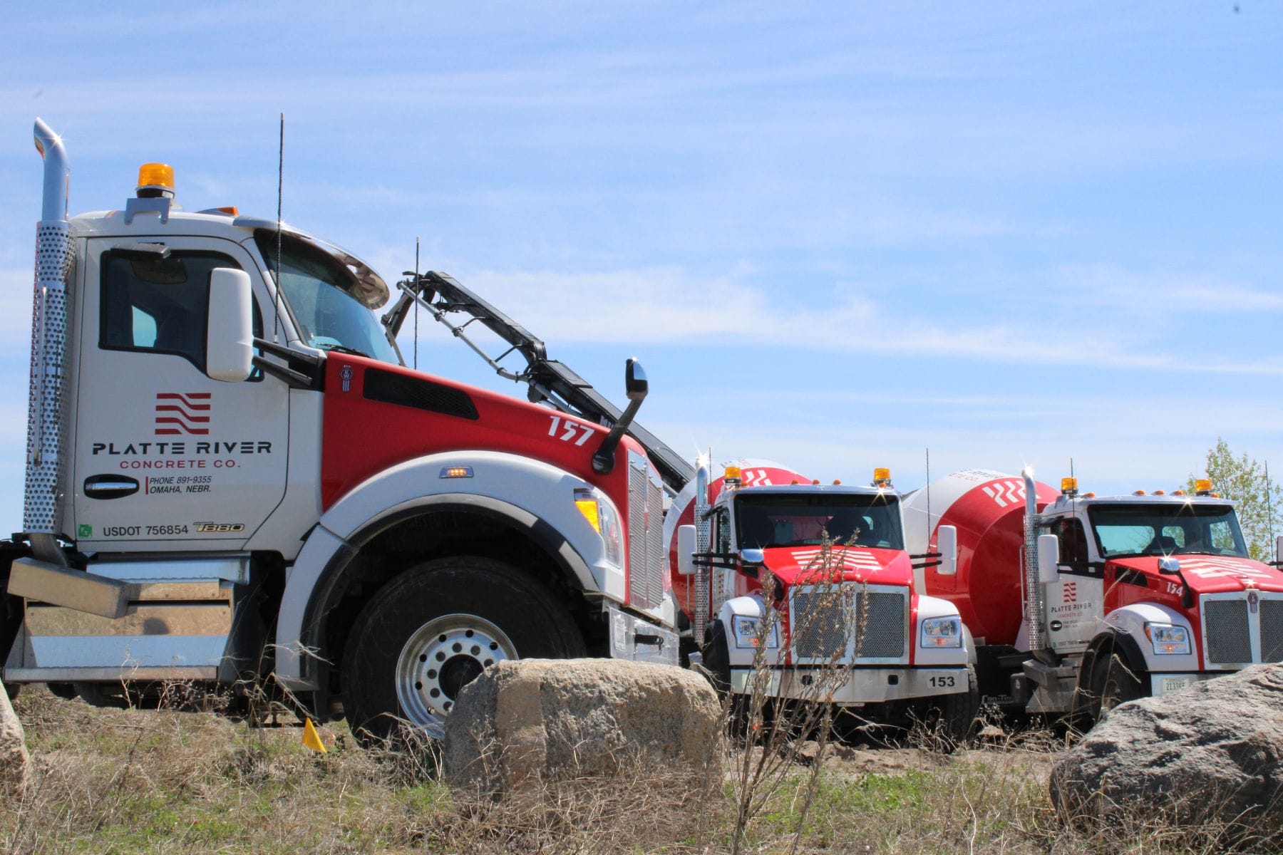
Vinyl Graphics
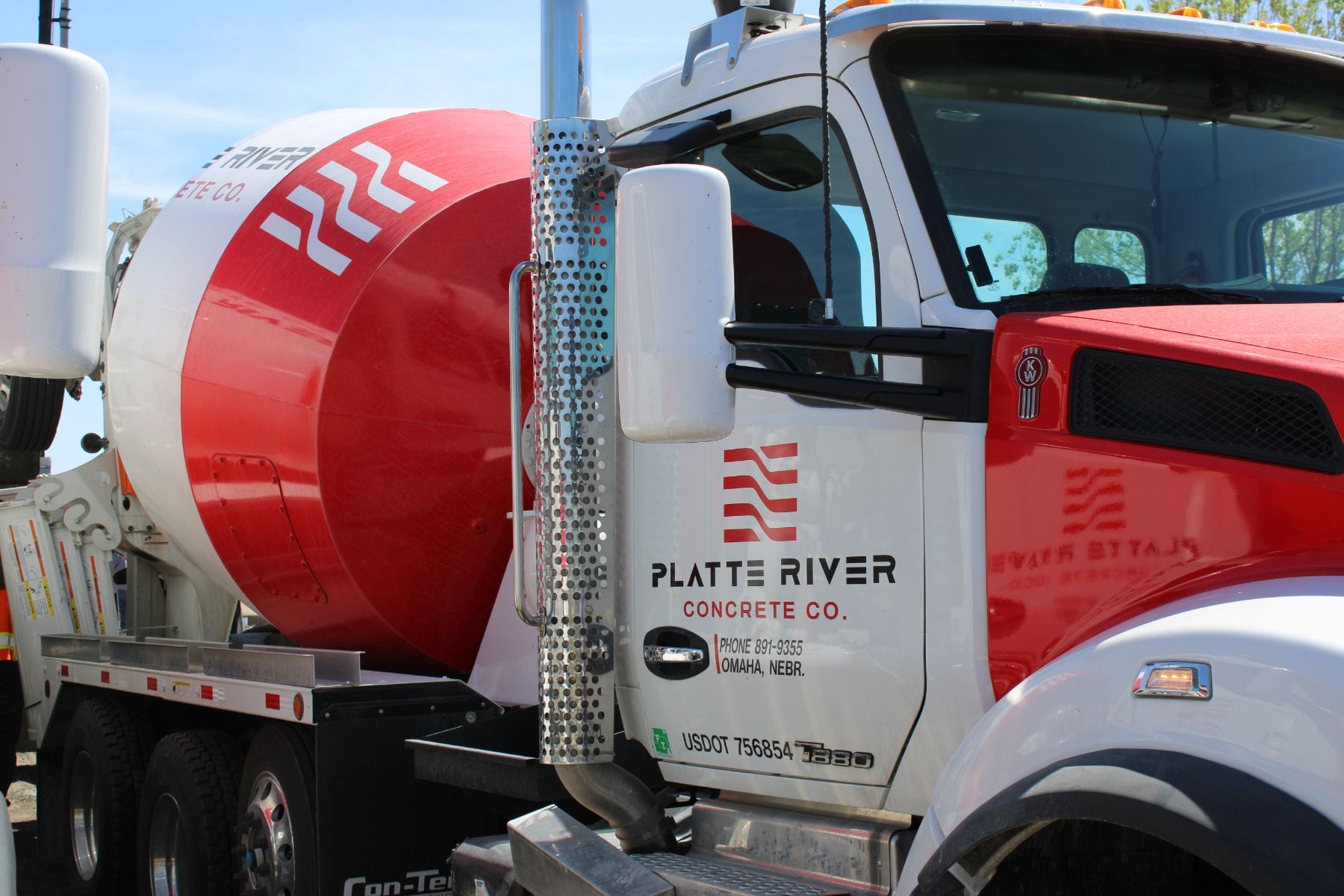
One of the ways we helped Platte River create their new identity was by creating vinyl graphics for their concrete trucks. These graphics are incredibly durable and can be applied to any surface. With these, we were able to develop a brand that could keep up with the ever-changing needs of the company without sacrificing its identity. This unique design is easy to eye catching from close or far away and is one of the companys most
Apparel
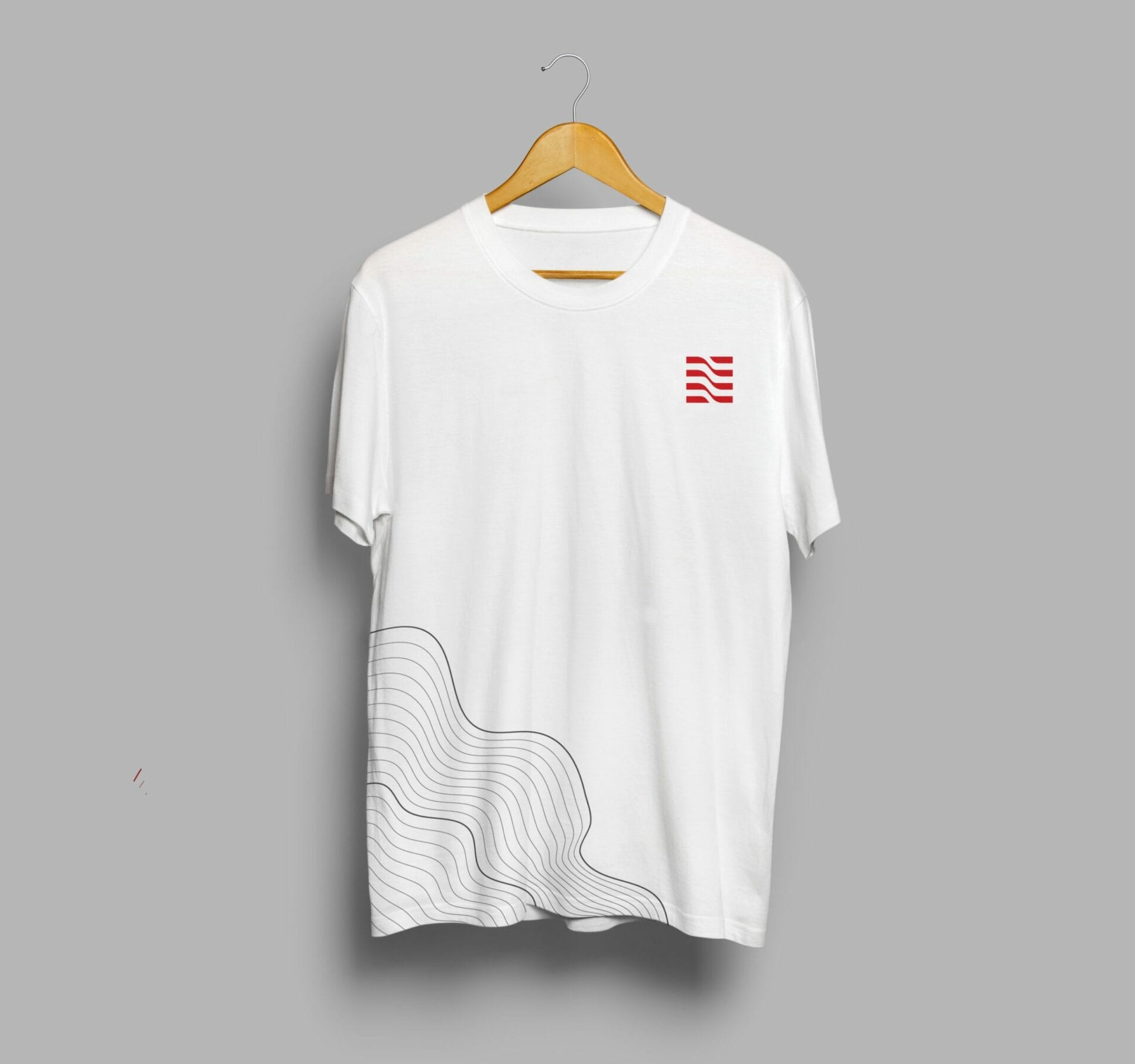
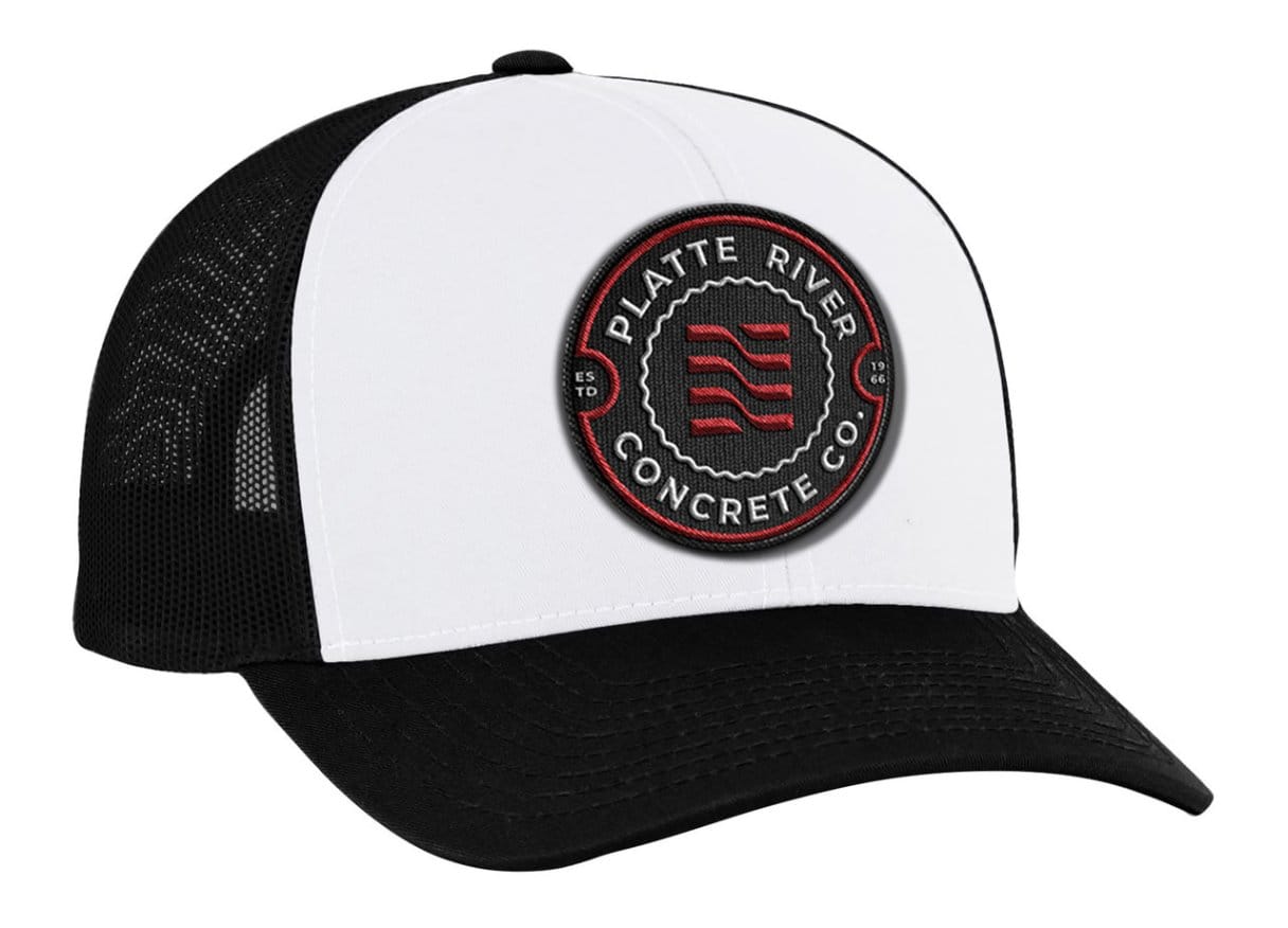
We created unique apparel designs that showcased their new brand identity. The design for their t-shirt reflects the unique style that they have developed by incorporating a logo that is defined by its “river” shape and a color palette that is both eye-catching and sophisticated. It also has a bold, modern look that makes an impact when viewed from a distance. We used their brand’s bold colors while still maintaining a level of sophistication in the overall design. The hat we developed is proffesional enough to wear on the job or dressed down with a t-shirt on the weekend. We also designed a badge for Platte River Concrete that not only complement the companyʼs new logo but use it as its centerpiece.


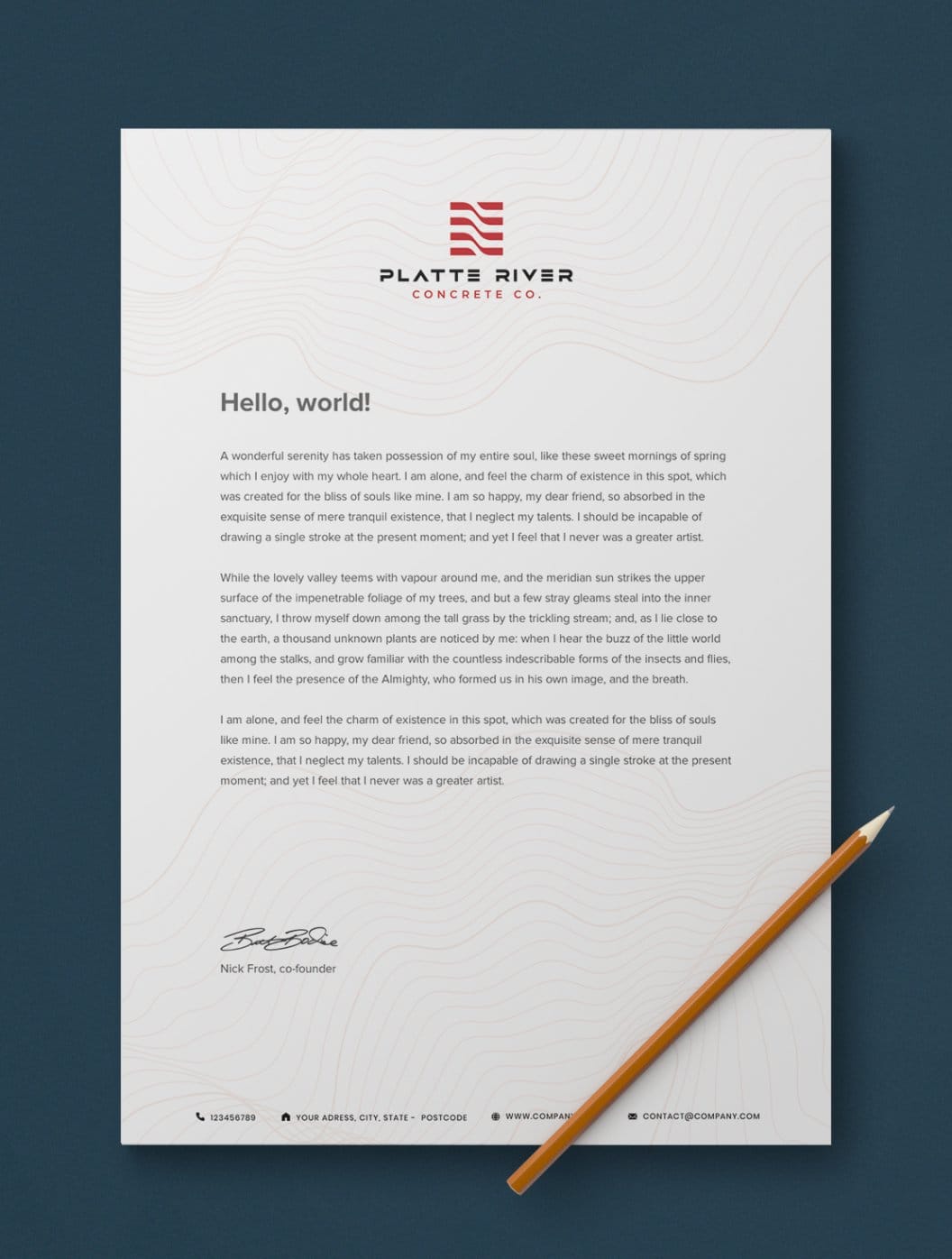
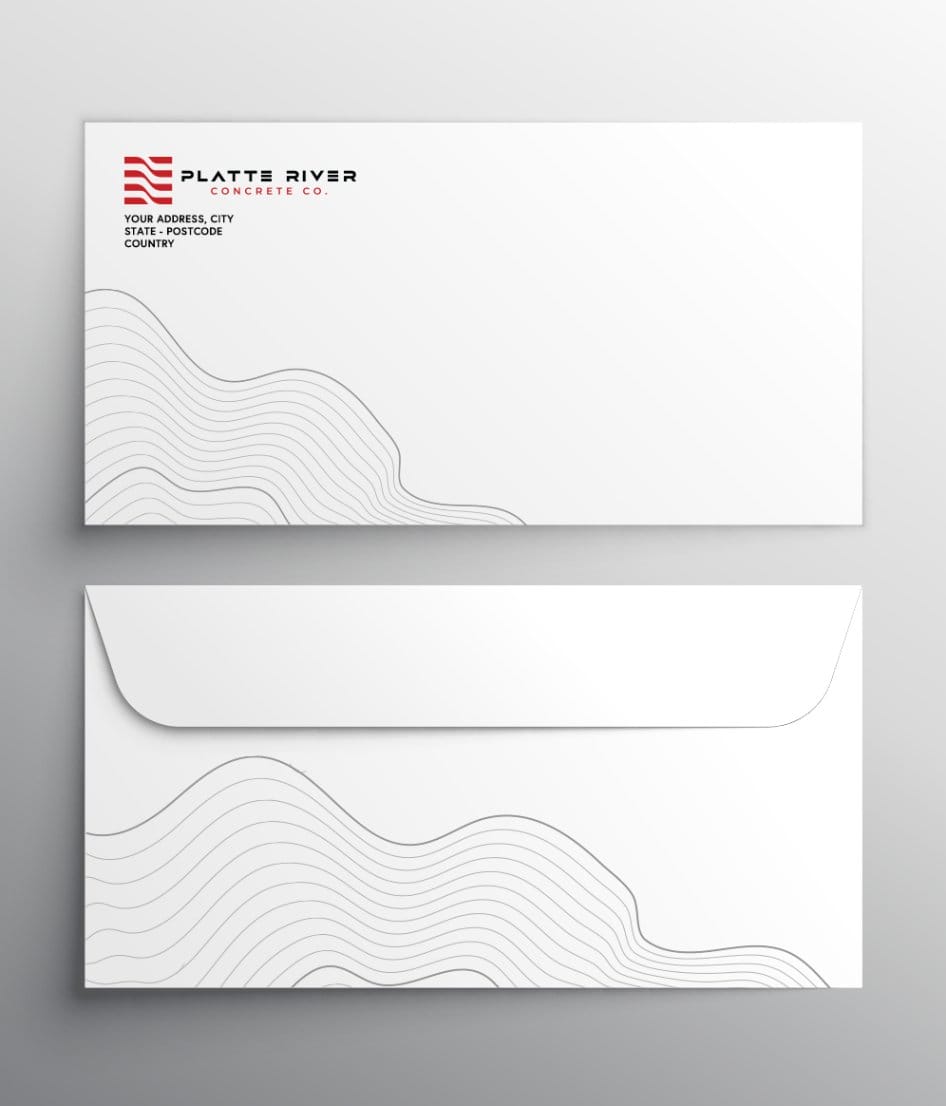
Print Design
We wanted to create an identity that felt modern and was more in line with the company’s new direction. Incorporating their new “wave” secondary assets into all print materials helped establish their new direction. These pieces will be printed and distributed
throughout their territory amongst other places that are relevant to their business such as trade shows and demos.

Website Design
When you design a company’s website, it’s important to understand how the site will be used. In discussions with Platte River we developed a custom concrete calculator to help solve a pain point their customers had. The calculator is an easy way to make sure that clients are getting exactly the right amount of material they need at the right price without the hassle of going back and forth with customer service or trying to figure out what kind of concrete their site is looking for. In conjunction with the backend development we applied their new brand assets throughout including their river water pattern as well as
custom photography.
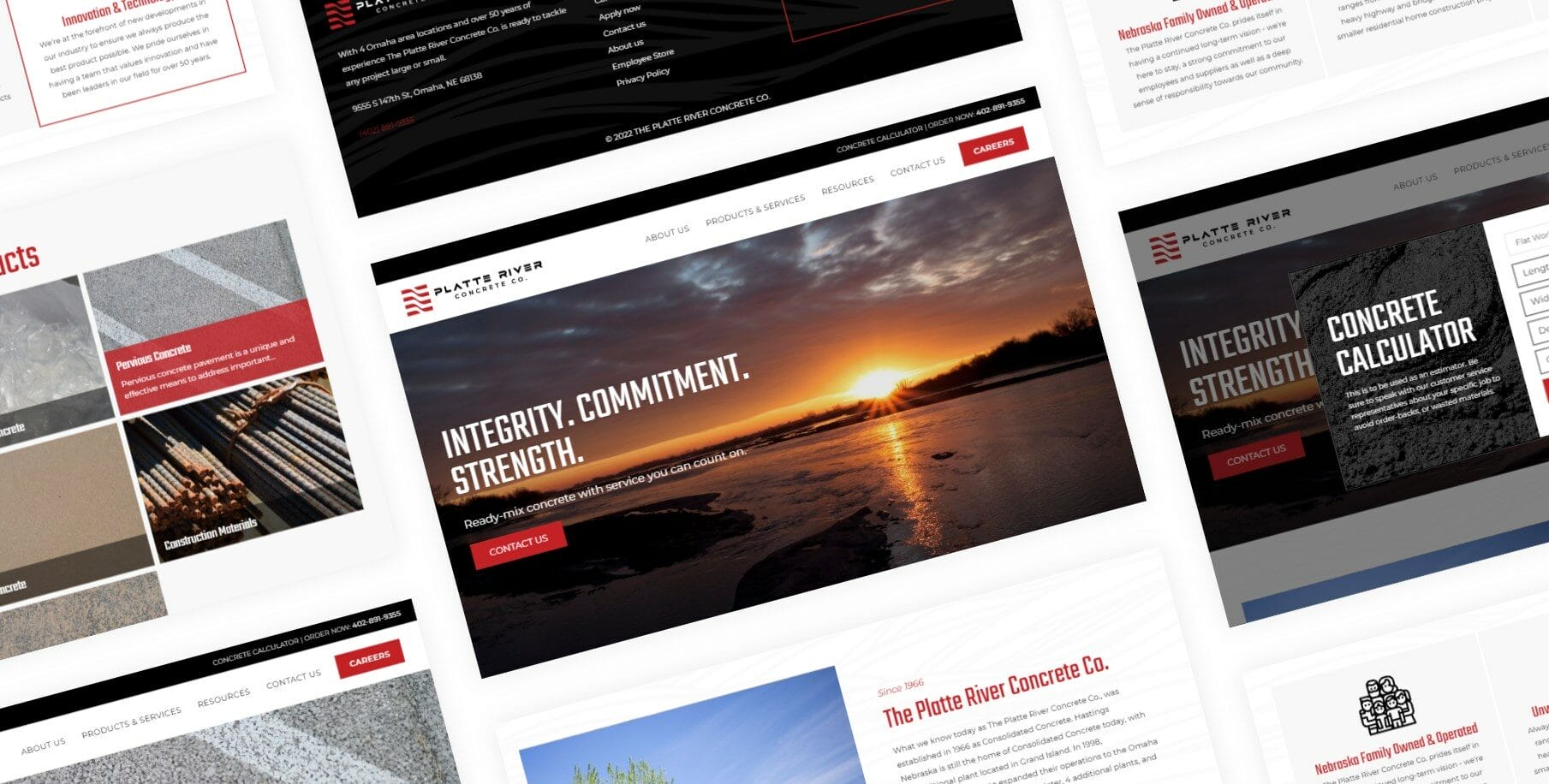
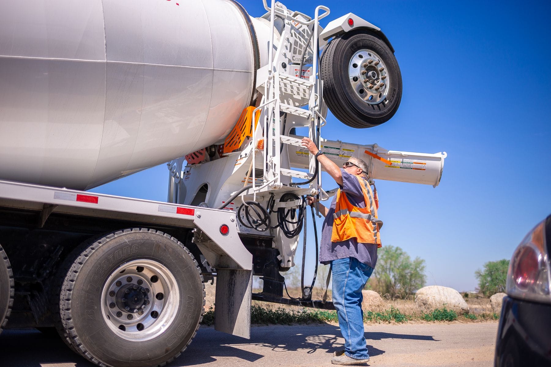
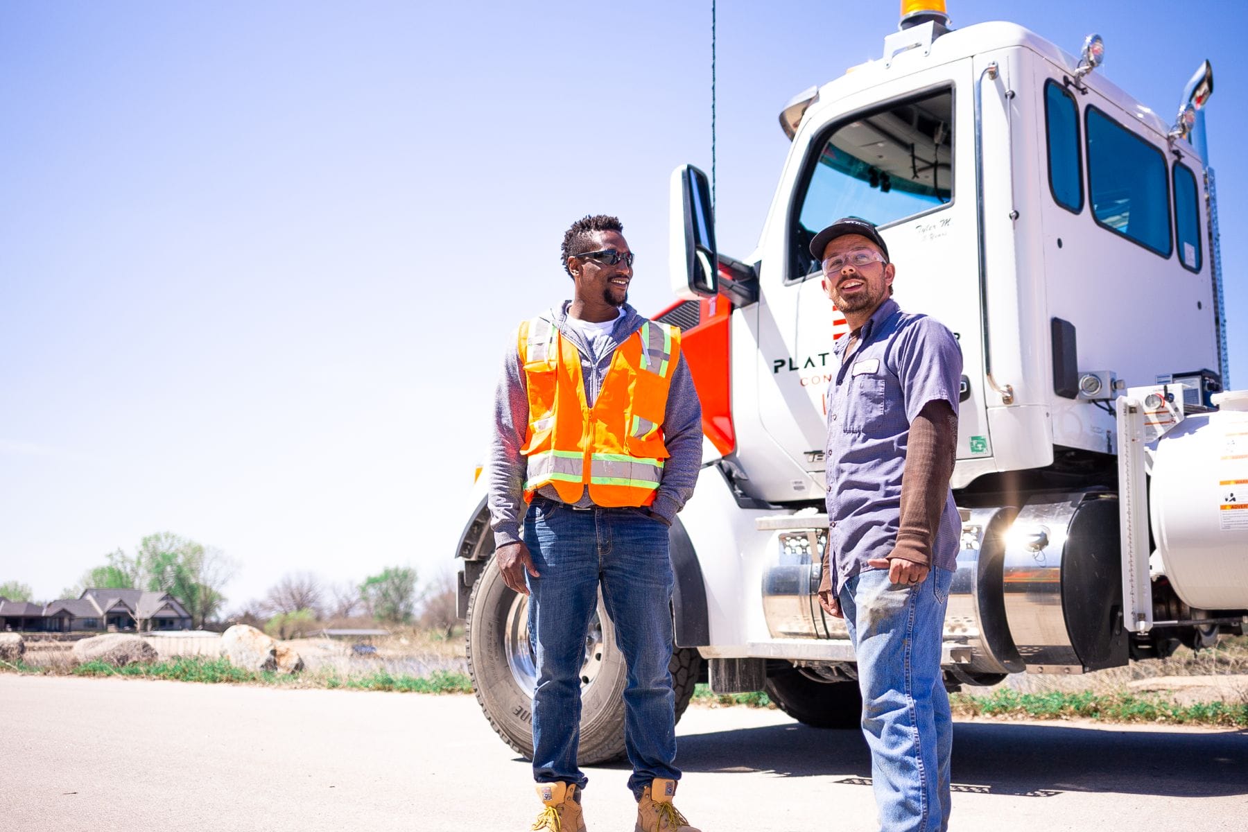
Photography
We knew that the logo and brand identity needed to be cohesive with each other. It was important for them to have one solid look that could be used across all of their marketing materials and online presence. So we took lot of photos, shot them in different lightings, and then created some mood boards to help get a visual idea of what they wanted. When we were developing their website, we decided to use the same color palette that they had chosen for the branding. This made it easy for us to match up their new logo with their website design as well as put in a callout box where they could share more about themselves and what makes them unique.